

Launching a brand for a key player in the parking industry
Sectors: Professional Association, Parking & Transportation
Services: Brand Management, Creative, Web Design, Brand Identity
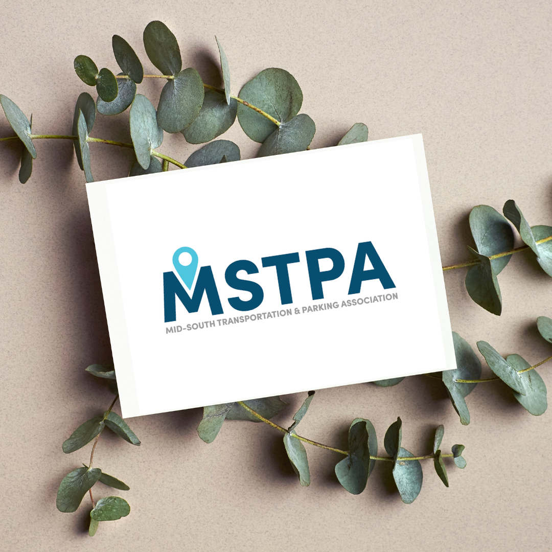
The Mid-South Transportation & Parking Association felt its brand was outdated and needed a facelift. Rooted Red Creative loves to sink its teeth into a good brand redesign so this partnership was perfect.
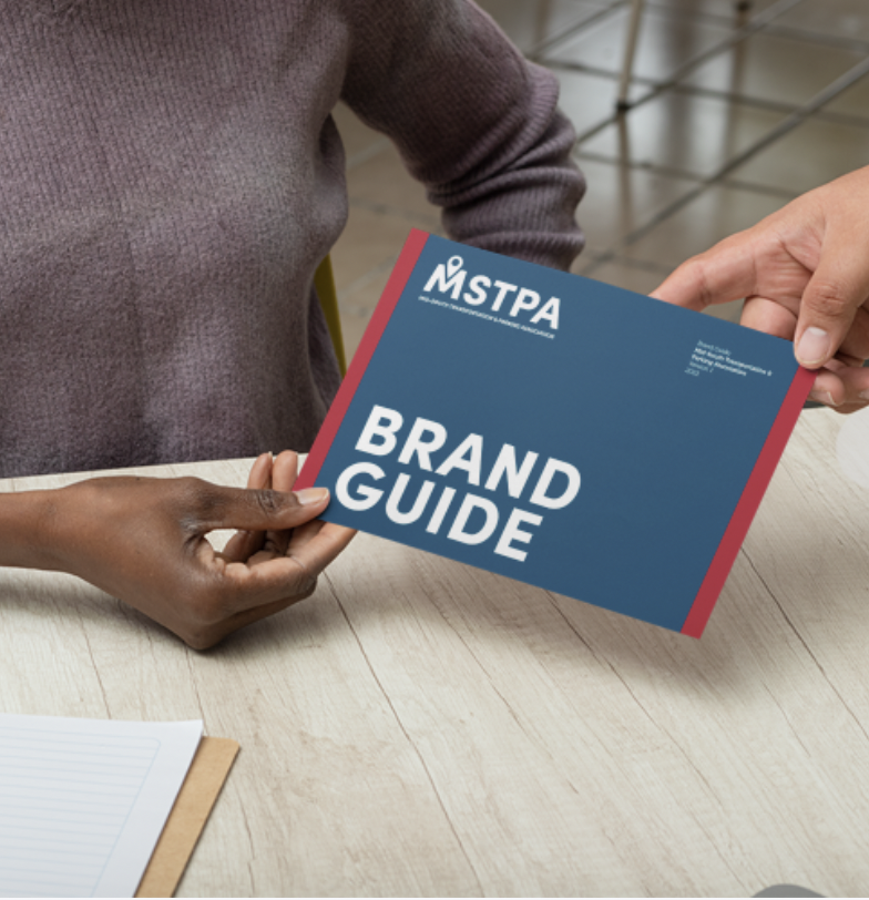
Rooted Red Creative met with board members and association leaders online for a discovery call and got to work creating a new logo. The process was pretty seamless and it took us about six weeks to land on the new logo. From there Rooted Red Creative put together brand guidelines and social media graphics.
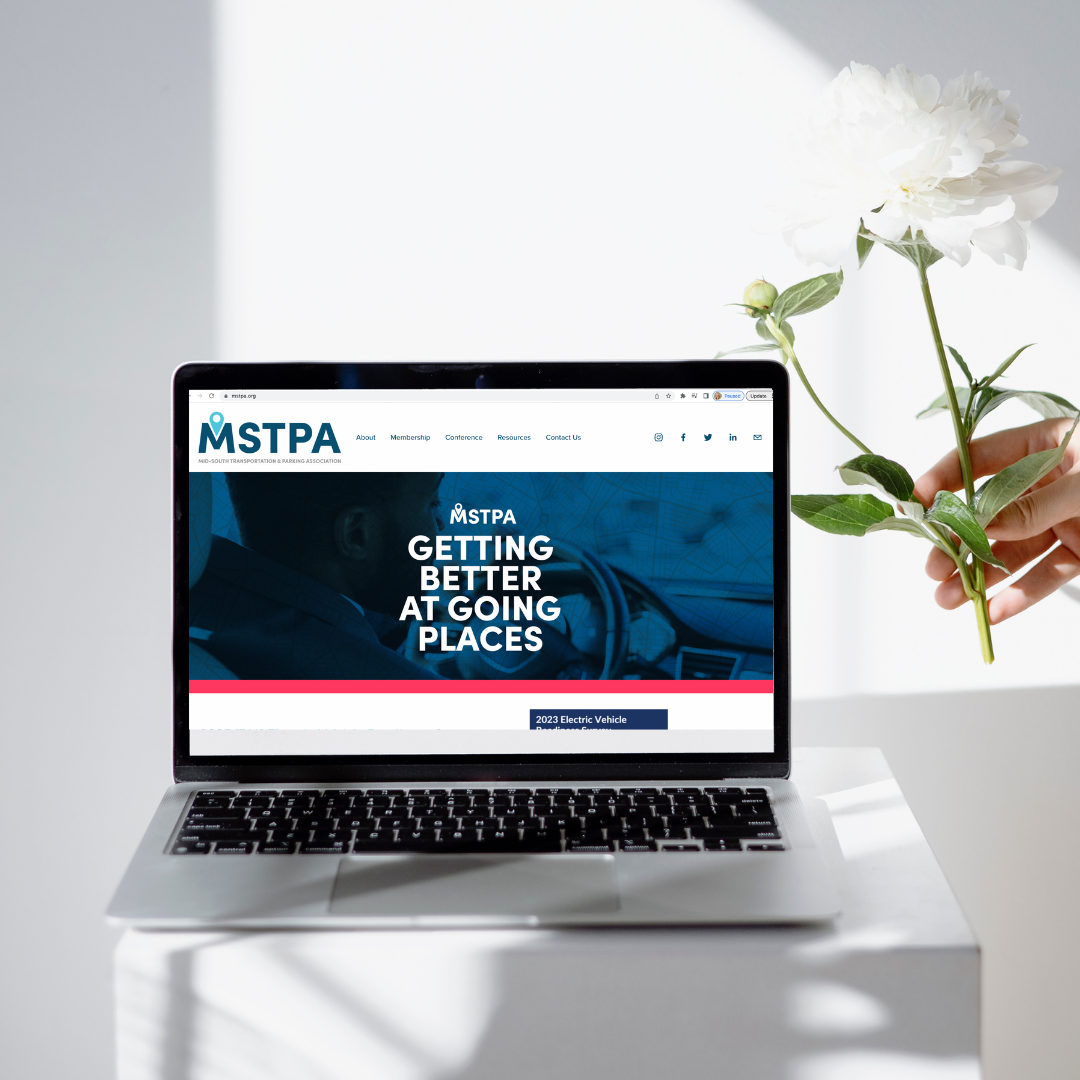
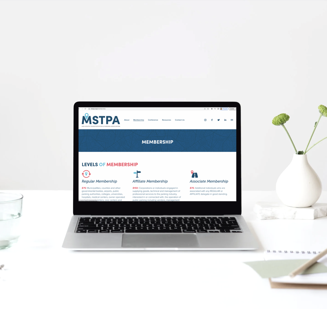
Once all of those brand pieces were finalized, Rooted Red Creative designed a new website for the Mid-South Transportation & Parking Association.

Brand Identity
Rooted Red Creative designed and implemented the Mid-South Transportation & Parking Association’s new brand identity. We designed the new logo, the new Brand Guide, and the new website.

Brand Design

Web Design
